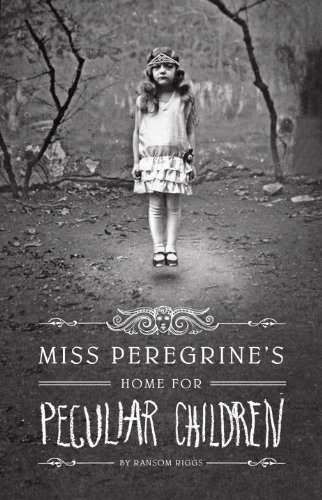
As I said, a great cover for me doesn't have to be pretty. And this cover isn't pretty. It's creepy. But it's so perfectly creepy and goes with the title so well, I would completely pick this book up just based on the cover. Look at the creepy little kid, who you notice after a moment is hovering. Kids are creepy. Kids in historical pictures are extremely creepy. Hovering kids in vintage photos have to be the height of creepy.
No comments:
Post a Comment