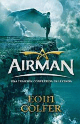
I'm mixing it up a little on this Shelf Candy. In finding book covers by going through Google it never fails to amaze me that a book can have an attractive cover at one point, be it hard cover or paperback or in a foreign language publication, but then have what I consider an either hideous one or at least lackluster one in the other forms of publication. I understand sometimes the hardcover jacket lends itself to more artistic or fancier covers (as well as probably the price), but considering we all DO judge a book by its cover to at least pick it up (trust me, there are some books I'm embarrassed to be caught reading because of how unattractive the cover is) it seems like someone would sit down and say "huh, this one cover just isn't that pretty compared to the others".
I'm using Airman by Eoin Colfer as my example today. Don't get me wrong, the US cover isn't all that bad. In fact it's probably a pretty good YA steampunk cover. Looks a little like the Rocketeer. Nothing wrong with that. But then I saw the Spanish language cover and was far more impressed by it. It's not just a steampunk cover, it's an artistic one.


Thoughts?
It is crazy how these deliver such a different message. The one on the left is more steampunk and the other is more mysterious. I like the one on the right better. I would be more likely to pick it up, although I do like steampunk. Thanks for sharing them both.
ReplyDeleteOooh I like the left one more. There's something about it that seems just so cool. Great pick!
ReplyDeleteHere's my Shelf Candy!
I totally agree with your assessment! I much prefer the cover on the right. It's not just more aesthetically pleasing, but also more mysterious. There's just so much more implied in it! The viewer still realizes that the book is a Steampunk novel, but there are other, more subtle things going on. The fact that the airman stands alone at the top of a cliff, on a brilliantly moonlit night, while the sea churns below... I feel his loneliness, his emotional turmoil, as well as the weight of the responsibility he bears on his shoulders... He seems to have come to a crossroad in his life, and is on the verge (the edge of the cliff is a metaphor here) of making an extremely important decision...
ReplyDeleteYou're right about the US cover -- I, too, am reminded of that movie, "The Rocketeer". This cover gives the potential reader a totally different message; it promises a lot of adventure, and not much more. The Spanish-language cover, in contrast, promises that, plus some psychological depth. I might end up getting this edition, since, luckily, I'm fluent in Spanish.
Thanks for sharing both covers! Sometimes foreign editions do have better ones!
Maria @ http://anightsdreamofbooks.blogspot.com/