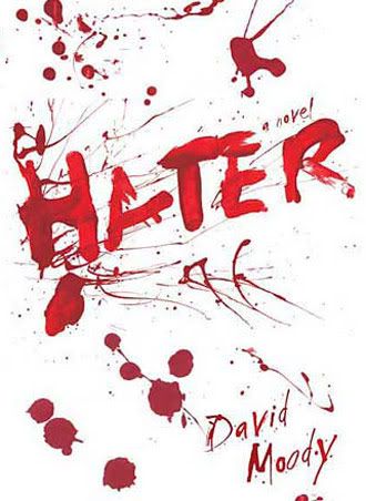
Last week I chose an old school looking cover for a steampunk novel. This week I'm going for something more minimalistic. And violent. And perfect for the novel.

Hater is for all intents and purposes, a zombie novel without being one. The world has been rocked by a strange phenomenon that causes some people to spontaneously violently attack people. There is no respect for age, race or gender and suddenly the world is plunged into fear over who will succumb next. People are afraid to go to work, leave their homes and realize that any moment could be their last. Soon the accepted thinking of the day becomes "attack first, ask questions later". The world has literally gone insane and is plunged into chaos. This cover is perfect to me. Simple. Striking. Nothing but blood splatter with finger painted letters. This would catch my eye on the shelf by its stark, brutal simplicity. Not a pretty cover by any means, but I love it.
Hater has a freaky cover. It does seem appropriate for the novel. I like minimal for some covers. It is nice to focus on the text (this being smeared w/ blood). Scary! I have a more minimal type cover coming up in a couple of weeks. Thank you for participating.
ReplyDeleteooohhhh, creepy!!! It makes me wonder who's blood that is.... lol.
ReplyDeleteThis is a good choice though and it shows that even simple covers can have a huge impact! great choice!